
Overview
Client:
CK Life
Role:
IA, UI, User Testing
Tools Used:
Figma
Adobe Illustrator
Invision (Prototyping)
Zeplin
Client:
CK Life
Tools Used:
Sketch, Adobe Photoshop, Figma
As the primary UX/UI Designer of an established North American home care provider platform CK Life, I redesigned their website keeping in line with their branding while using user research data to improve Information Architecture, User Interface and delivering production-ready mockups across multiple responsive breakpoints.
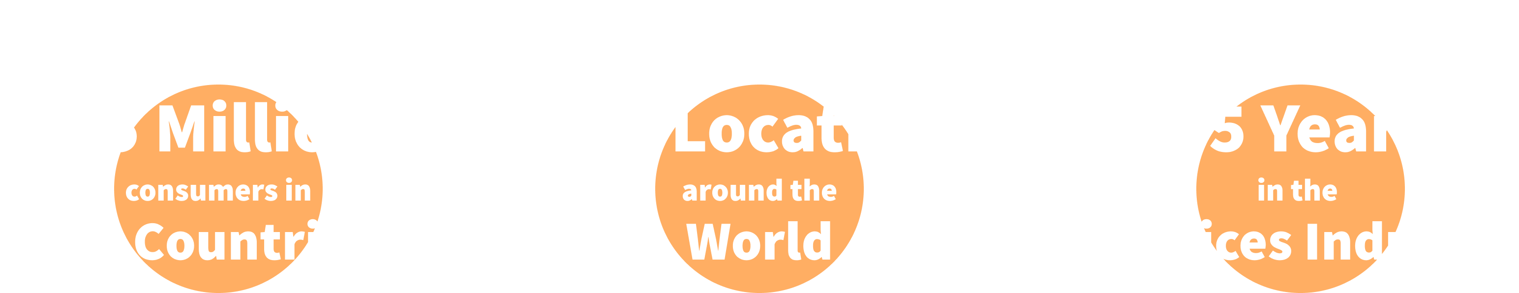
CK Life is run by Sodexo - a large facility management company that has been around for almost half a century. Initially, there was no shortage of clients for CK Life and the necessity to have a user-centred website wasn’t really there until they came across a big problem. The shortage of caregivers led to fewer booking options for customers and hence less revenue for the company. Two months after going live, the website had an average 23% increase in app downloads (iOS and Android). Sign up data also showed that 68% of these downloads were caregivers.
Here are a few more facts about Sodexo:
The Problem
.
In order to develop a strategy, I started to dig into what the objectives of the website would be. So I began asking questions such as "Why are you looking to redesign your website now? What are you looking to achieve and who is the target audience?" This is what I found:
User Problem
"Caregivers need to be able to easily navigate through CK Life's website to find what they need and also know that they are a trusted organization before they sign up"
CK Life has a shortage of caregivers which is the main reason why they approved a redesign of their website. This was part of a larger campaign to get more caregivers and people who need caregivers to trust their brand. Of course, without caregivers, there are no customers and revenue.
Keeping both problems in mind: How might we improve CK Life's website's experience so that it increases their enrollments of caregivers and provides more scheduling options to users. Based on the information provided, I decided it was best to base my strategy around attracting caregivers using the following techniques and best practices:
Objectives
Customer Confidence: To increase the level of trust the audience has in the brand as soon as it lands on the webpage (User Interface).
Intuitive Navigation: To help the audience locate exactly what they are looking for, even if they aren't entirely sure what it is (Information Architecture).
Product Comprehension: Helping the user better understand the product by ensuring no information is missing (Copy Writing).
Product Comprehension: Helping the user better understand the product by ensuring no information is missing.
Caregiver Interviews
Next, I conducted expert interviews with 6 caregivers that currently work with different hiring platforms to uncover any pain-points. CK Life did not allocate any money towards interviews, but since I was working out of BookJane's offices, I realized that we needed to take advantage of the fact that new caregivers were stopping by to get their certifications verified and interview them.
Assumption: Caregivers consider the user interface design and the ease of use of their website when choosing a staffing agency given that all other factors such as location and pay are the same across the industry.
Findings: While "professionally designed websites" and ease of use were brought up in some instances, a common theme across all interviews was that most caregivers found it difficult to find the information they needed before committing to an agency.
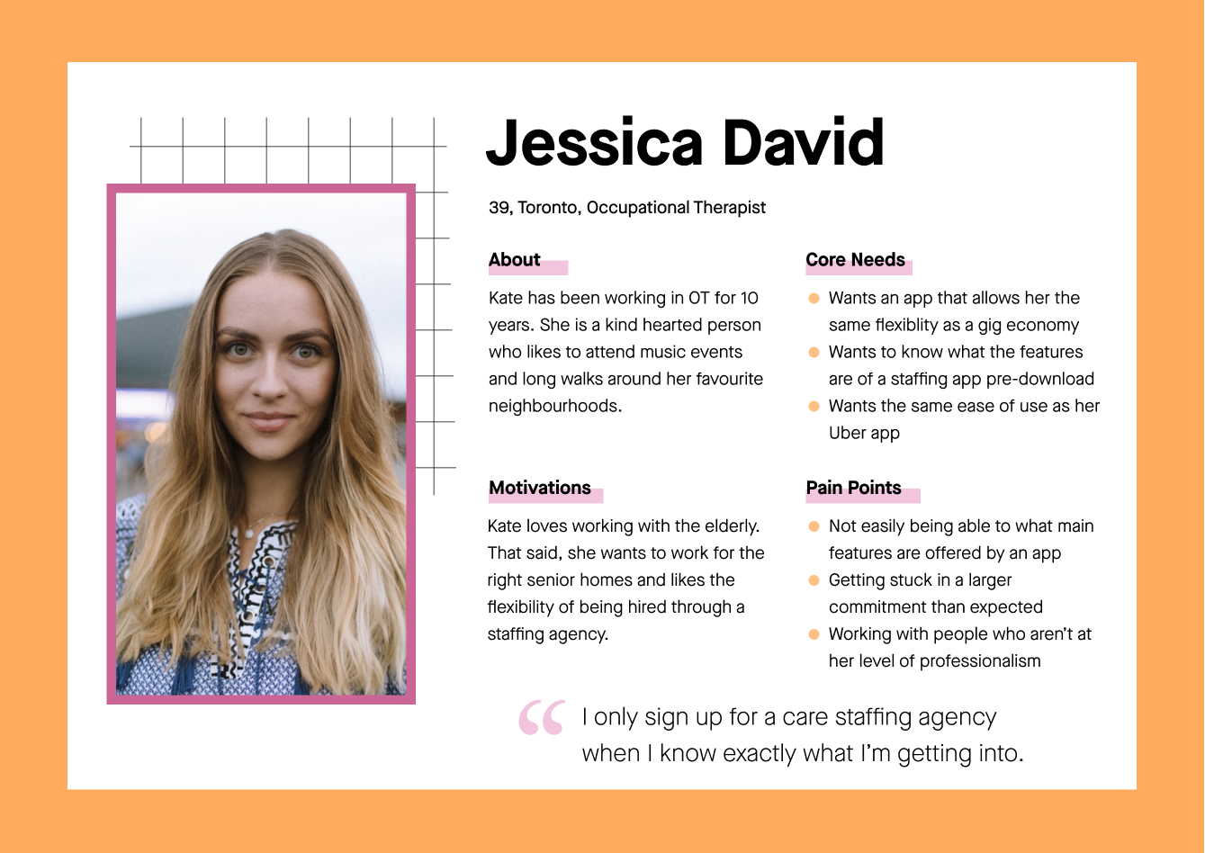
Primary User
As I was clearly seeing a trend in all of the interviews conducted, I moved forward with a primary persona for CK Life's user.
Journey Map
In order to keep the design anchored on the user, I created a journey map to illustrate how a caregiver, Jessica, goes about finding the perfect job and discover opportunities for improvement.
This is an attempt to shift CK Life's approach from inside-out to outside-in. We can see that she starts off feeling uncertain, but as she goes through the steps her feelings start to fluctuate. Creating a journey map enabled me to visually highlight where we can make improvements on the platform.
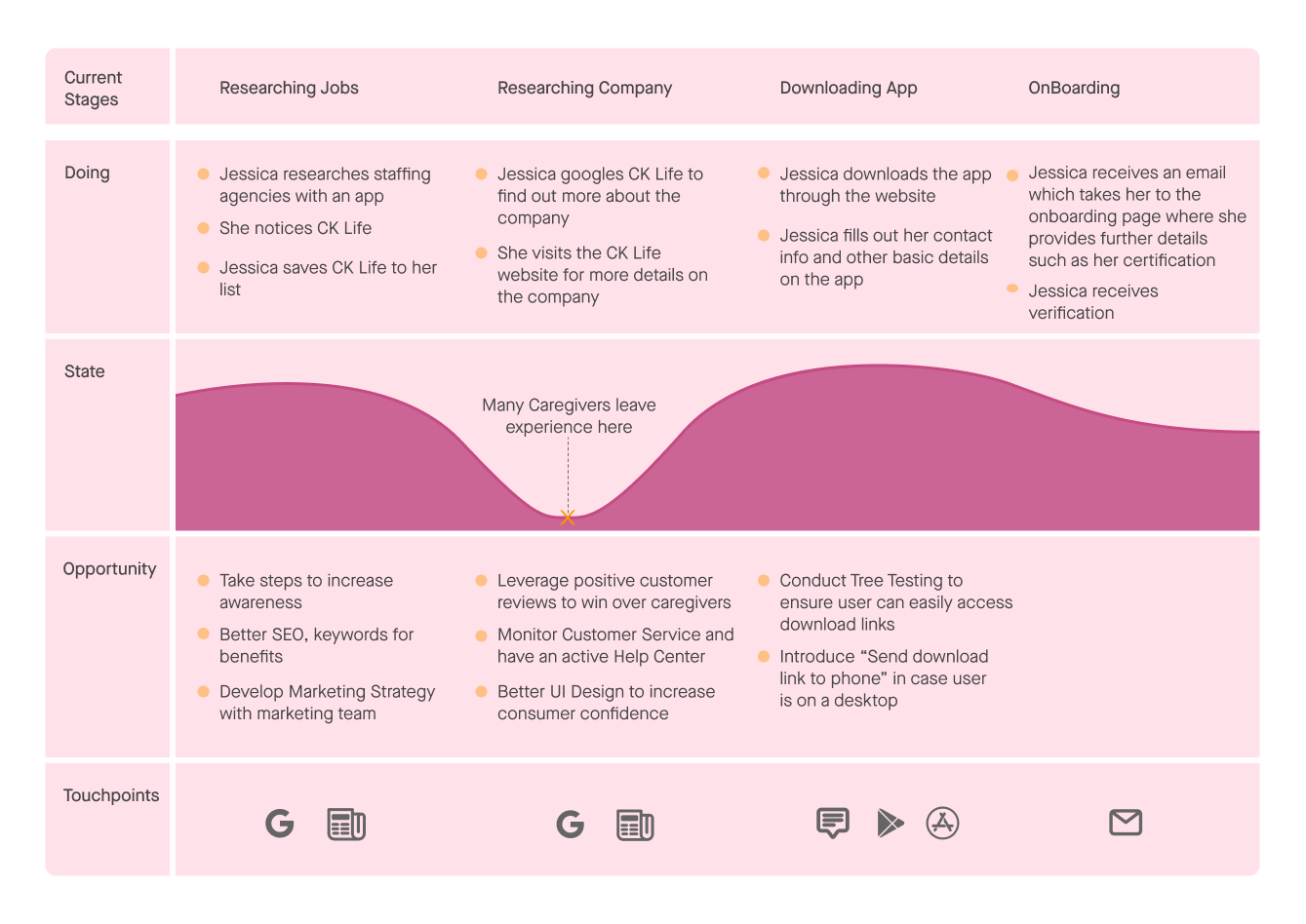
For example, when downloading the app we can see that Jessica is feeling apprehensive. Features such as being able to text yourself the link to the mobile app were added for convenience. This was in the case that users were unable to locate the download the app page or were on a desktop or laptop. Additionally, we added multiple download call to actions to download the app on applicable pages, and also added explanatory messaging + value proposals throughout the website.
Copy Writing
I sat with the product owners and marketing team to get a thorough understanding of the product. In order to apply best practices for copy and microcopy writing while keeping the user in mind, I suggested that we avoid company jargon that currently exists in the app. While existing users may understand such terminology, it will confuse new users when they navigate through the website. Other UX writing principles such as explanatory messaging, value proposals, call to actions, were all applied to every single page. It is also important to note that the copy was written keeping SEO principles in mind.
Information Architecture
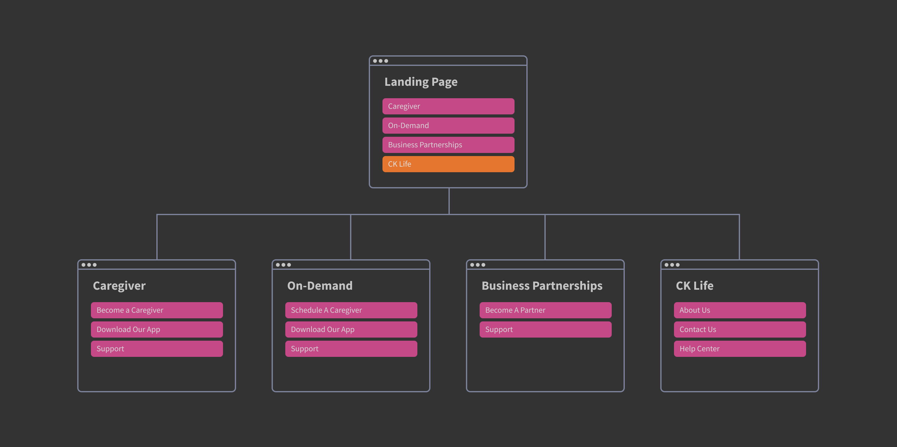
While working on the new blueprint of CK Life’s new website, it was important to optimize the number of categories through which users could easily access what they need. Originally there were 7 categories, however, grouping was necessary to ensure that the taxonomy was not confusing to the user.
As you will see in the exhibit below, I decided to classify website structure using audiences that CK Life caters to, plus one more page for people who want to get in touch or learn about the company:
- People who need care
- People who provide care
- Businesses that need caregivers (such as senior homes)
While all of these audiences are connected in the sense that they work with each other, the interfaces used by each are different and hence it is easy to draw boundaries between them. This was validated through Tree Testing which helped me determine which link users matched each category. The final result was as follows.
Sitemap
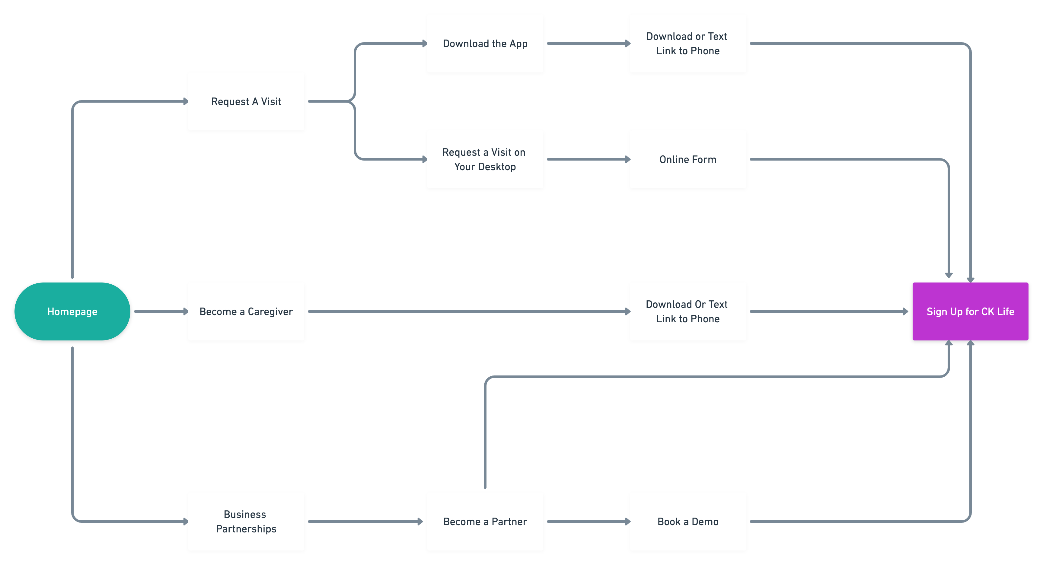
Userflow
To best understand these needs and the experience we want the caregivers to have, I mapped and visualized each step of their interaction with the interface.
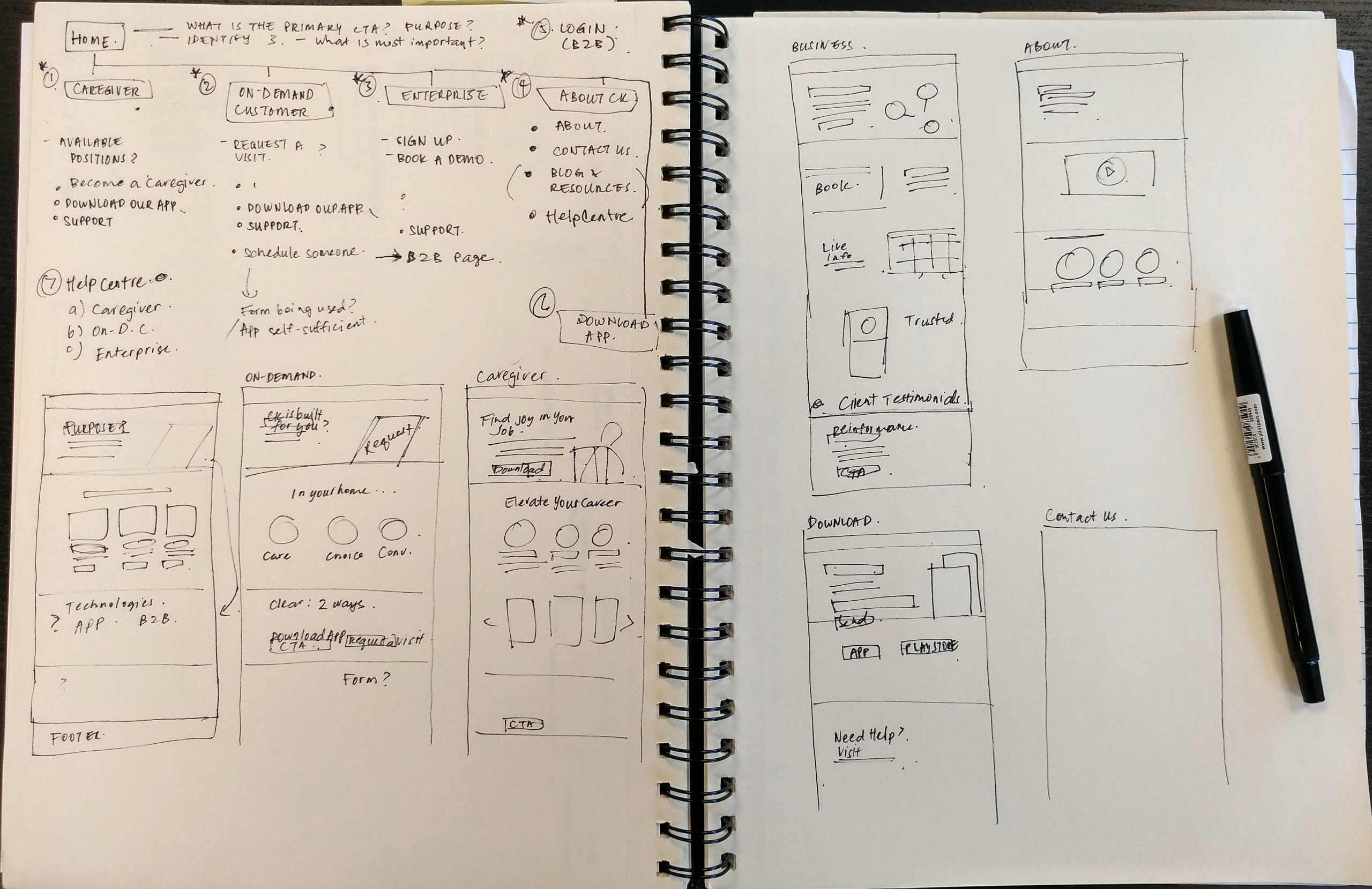
Early Sketches
I drew out some of the solutions I had for the website in order to communicate ideas to my peers and iterate on them before jumping into designing low fidelity wireframes.
Wireframes
Low fidelity screens always help to identify and prioritize MVP features with the dev team and create a timeline for the workable prototype.
Usability Testing
The Tasks:
1) Find out more about the Caregiver program.
2) Contact CK Life.
Out of the data that I received from testing numerous caregivers here is some of the information that I learnt about the wireframes, which led to the final iterations of the website:
- The website needed more call to action buttons as some people were getting lost in all the information. Hence call to actions were put at the top as well the bottom of each page.
- Users were used to seeing certain information in certain sections of a website so instead of reinventing the wheel we placed About and Contact Us sections under the CK Life section of the Navbar.
- Quite a few users said they were scrolling down to the end of the page to find the sitemap so we decided to include all the pages in the website footer.
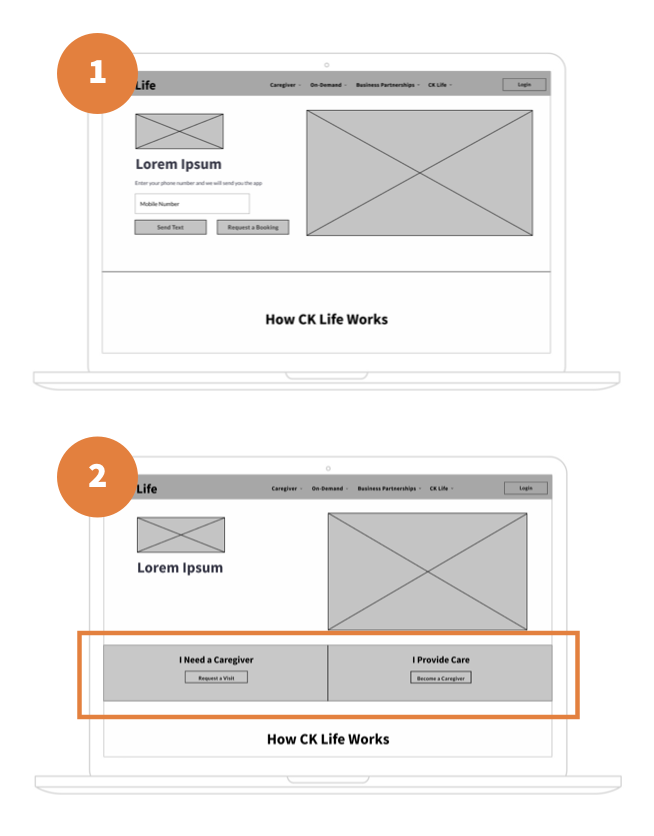
In one of our later iterations, we had to change the main page (see above).
Landing Page 1:
CK Life wanted me to incorporate an input form into the landing page where users could text themselves a link to the app. I argued that we would need to convince the user to use our service first, but in order to keep the client happy I gave in. This was a mistake as I will explain below.
Landing Page 2:
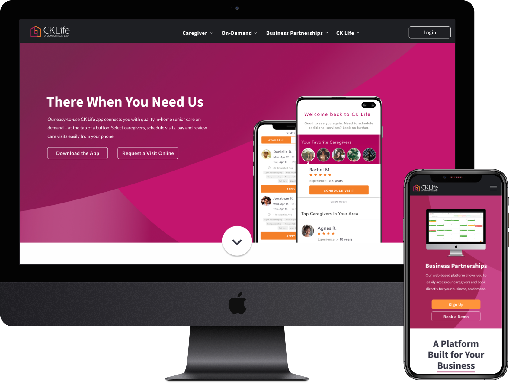
After the contextual inquiry, it was obvious that users struggled to find the information they needed when on the main page. I was able to take this data back to the client and show that we needed clear messaging as soon as the user lands on the page. I added titles on top of the call to action buttons into the hero image: "I Need a Caregiver" and "I Provide Care". This was to ensure that all users understood what they were doing when they clicked on, for example, Request a Visit.
Design System
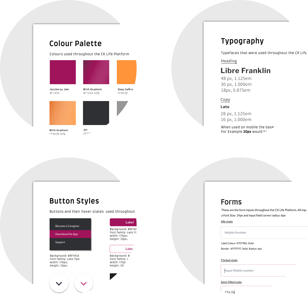
User Interface
User Interface
I initially began by looking back to the user personas to determine what they would be using and looking at in everyday life. Moodboards were created to help begin to visualize the approach that would suit the application and Sketch was then used to start to design the UI. These wireframes were then uploaded to Figma to be used as prototypes and onto Zeplin for developer handoff.
View prototype
Conclusion
User Interface
Keeping in mind the goals for the new CK Life website, I found that creating strong Information Architecture and hierarchy early on in the process set the precedent for how aesthetically pleasing the product will be. How a product organizes information and navigation is the backbone of intuitive design because people can only make sense of what service is offered if there is digestible architecture laid out for them. This provides seamless product comprehension, uncomplicated UI and hence increases consumer confidence leading to an average 23% increase in app downloads (iOS and Android). Sign up data also showed that 68% of these downloads were caregivers helping CK Life address their shortage problem.