
Overview
Role:
Senior Product Designer
Company:
GoBolt
Project Type:
End-to-End Experience Design - Customer-Facing Logistics Platform
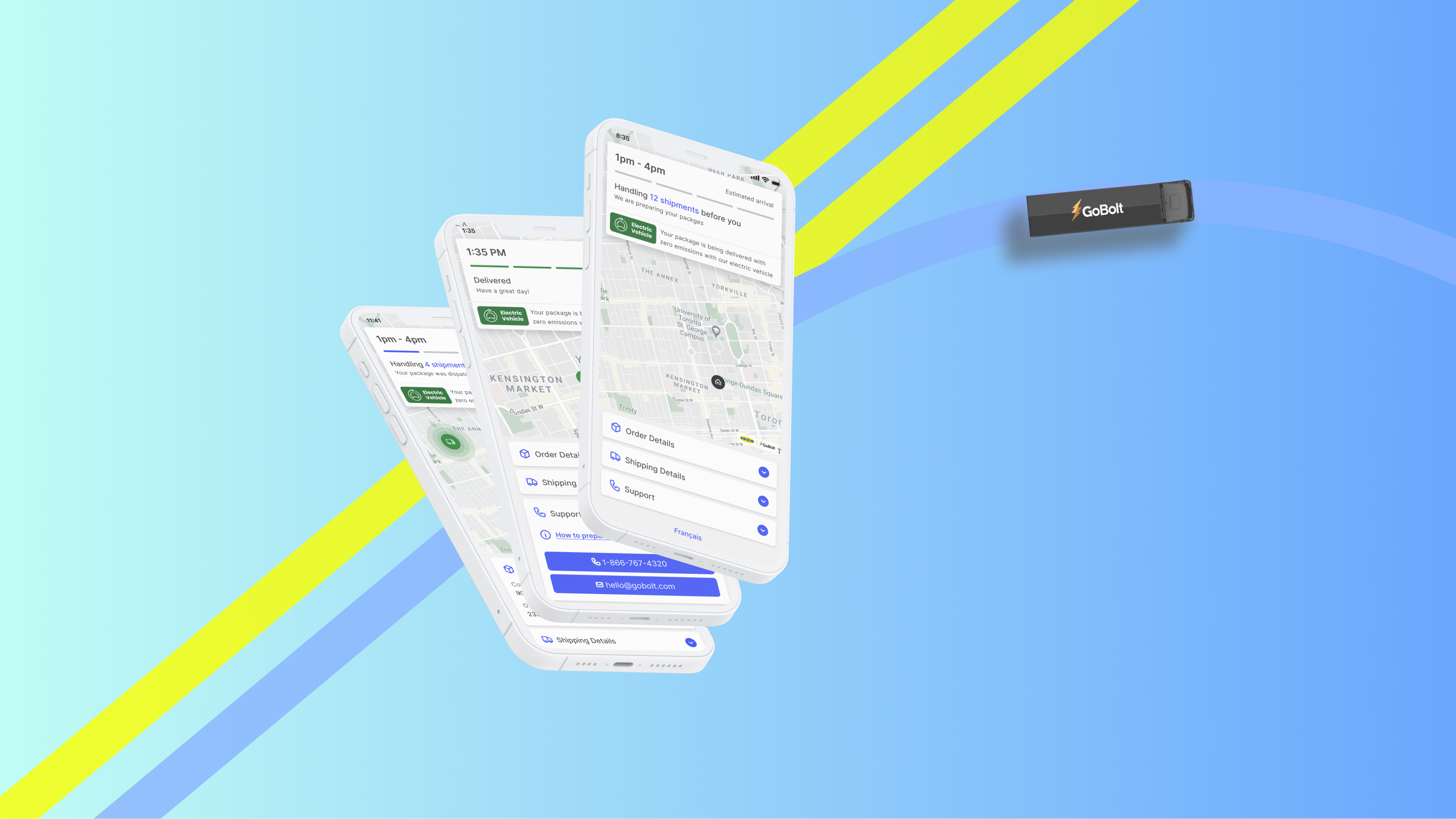
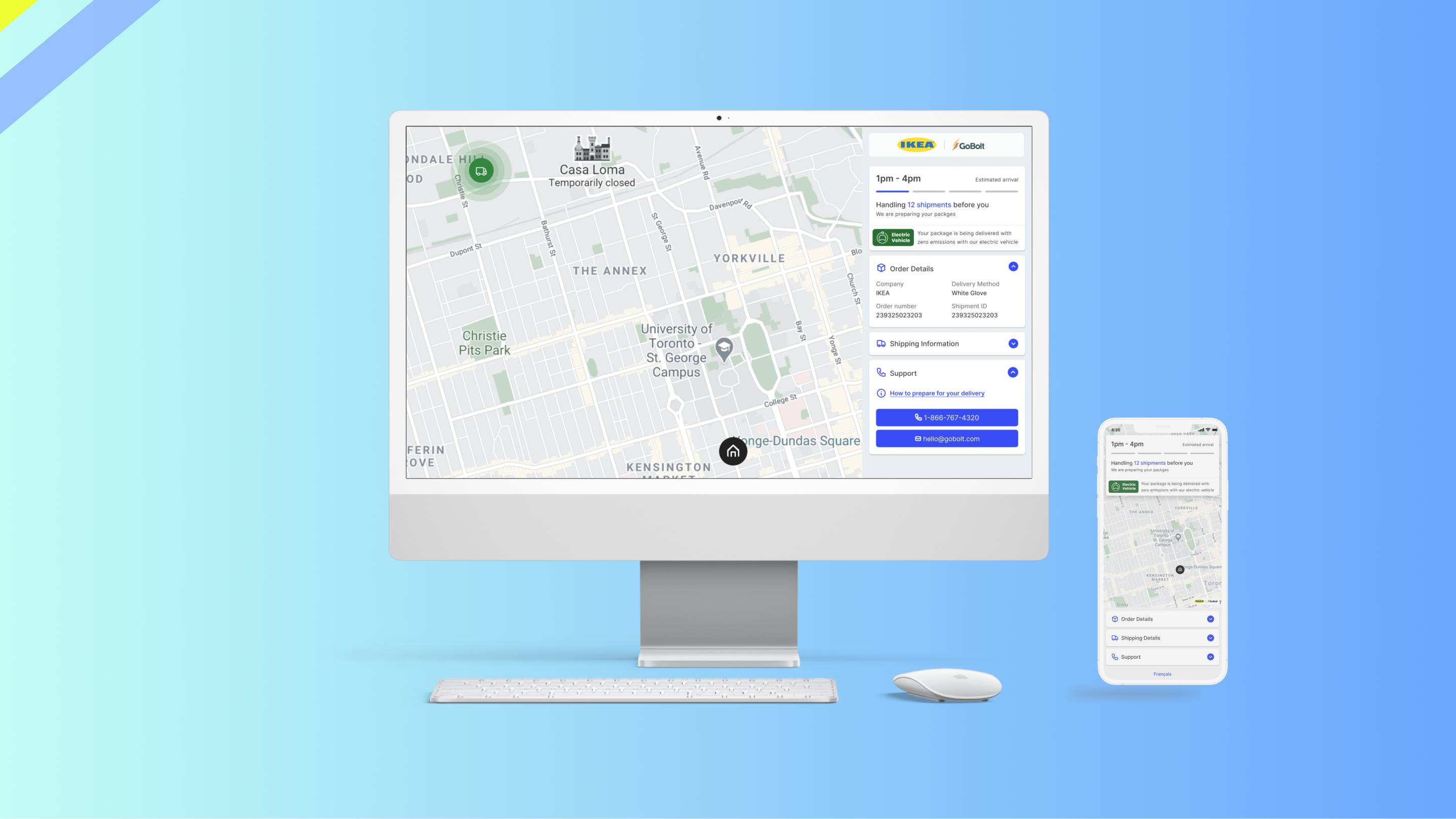
Galileo is a delivery tracking web app I designed at GoBolt to reduce the stress of last-mile logistics for large items, where the customer needs to be present at the destination to accept the order. At the time, delivery tracking offered customers little more than broad windows (“12–6 PM”), forcing them to reorganize their day and often leading to missed deliveries and rescheduling.
Initially scoped for IKEA customers, Galileo’s success led to rapid adoption by multiple merchants due to it's 36% reduction in missed deliveries within a month, becoming a flagship differentiator for GoBolt.
My Role:
- Aligned C-suite, merchants, and internal teams through workshops and research.
- Led user interviews, created personas/journeys, and defined the problem space.
- Designed and tested prototypes; identified usability issues and drove iteration.
- Navigated executive resistance with customer-driven evidence to secure buy-in.
- Delivered final flows, high-fidelity designs, and specs that reduced missed deliveries and boosted customer satisfaction.
Problem
Despite e-Commerce orders at an all-time high (post-Covid lockdowns) and a larger volume of expensive orders being shipped directly to customers, users still do not have clarity on when their order is arriving. This leads to stolen or missed deliveries which are pain points for the merchants and their customers.
Solution
E-commerce customers need to be given the ability to track their orders with live updates should they need to be present at the time of arrival. Doing so will make it less likely for them to miss the delivery or for their orders to be damaged or stolen. Such a solution is a win-win for both the merchant and their customers.
1. Business & Operational Discovery
Stakeholder Workshops
My Role: Facilitator & Strategist – I designed and ran collaborative workshops with internal teams (product, ops, engineering, customer service) and external merchant partners.
Why: To align everyone on business objectives, operational realities, and customer expectations before defining the solution.
Key Findings:
- Merchants recognized that fulfillment = brand experience; poor delivery hurts customer loyalty.
- A better delivery experience could directly lead to higher repeat purchases.
- Missed deliveries created significant operational cost through rescheduling.
Secondary Quantitative Research
My Role: Researcher – I sourced and synthesized Canadian eCommerce reports, particularly from Canada Post.
Why: To validate the scale of the problem, understand expectations and ensure we weren’t designing in isolation.
Key Findings:
- 90% of Canadian shoppers actively track packages.
- 80% have high expectations for accurate tracking.
- 30% avoid repeat purchases after a poor delivery experience.
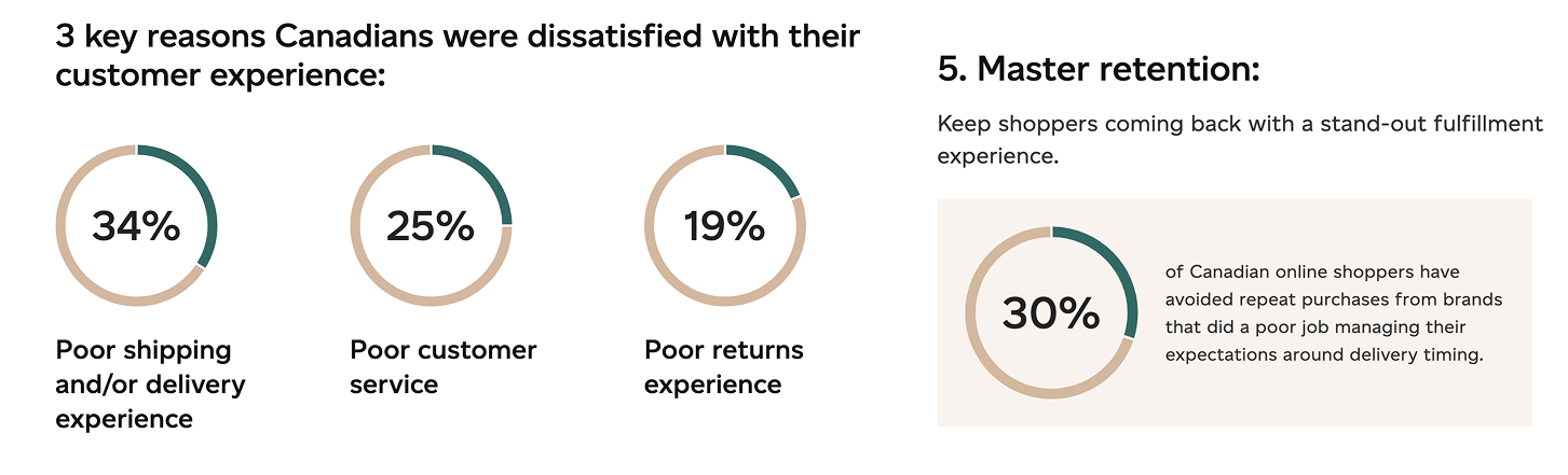
Canada Post eCommerce report 2022
2. Customer Discovery
Interviews
My Role: Research Lead – I planned, conducted, and synthesized qualitative interviews with customers who purchased high-value or bulky items.
Why: To understand the emotional and behavioural side of delivery anxiety that data alone could not explain.
Key Findings:
Broad delivery windows cause stress and disrupt daily life.
Missed or delayed deliveries directly erode brand trust.
Shoppers increasingly seek eco-conscious brands to align with personal values.
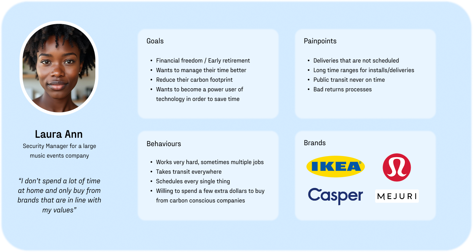
Persona Development
My Role: Synthesizer – I created a persona (“Laura Ann”) that captured recurring behavioural patterns.
Why: To anchor design decisions in a relatable customer story that balanced goals, frustrations, and values.
Key Findings:
Works long hours, values time efficiency, and schedules every task tightly.
Experiences stress and frustration when deliveries require them to be home for 6-hour windows.
Willing to pay more for sustainable, environmentally conscious delivery.
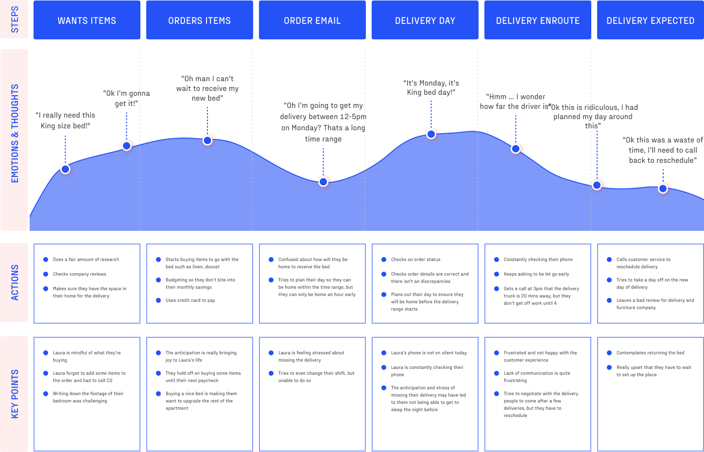
User Journey Mapping
My Role: Mapper & Facilitator – I facilitated cross-team session with Product and Customer Success to co-create an end-to-end journey map for Laura’s delivery experience.
Why: To reveal emotional highs and lows, uncover hidden pain points, and align everyone on where design could have the greatest impact.
Key Findings:
Delivery day is the most emotionally charged moment.
Customers experience anticipation, anxiety, and frustration in quick succession.
Lack of real-time communication and time-range delivery often resulted in dissatisfaction with the brand.
3. Defining the Problem
How Might We Statement
My Role:
I synthesized insights into a “How Might We” framing to give the team a clear, user-centred design challenge that narrowed focus and prevented scope creep.
Framing:
How might we offer shoppers clearer visibility on their order's
ETA so they can be available at the time of delivery.
4. Designing & Testing the Solution
Early Ideation
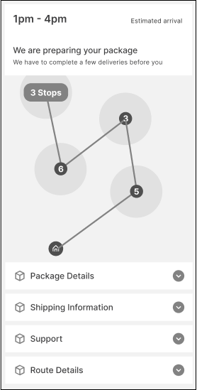
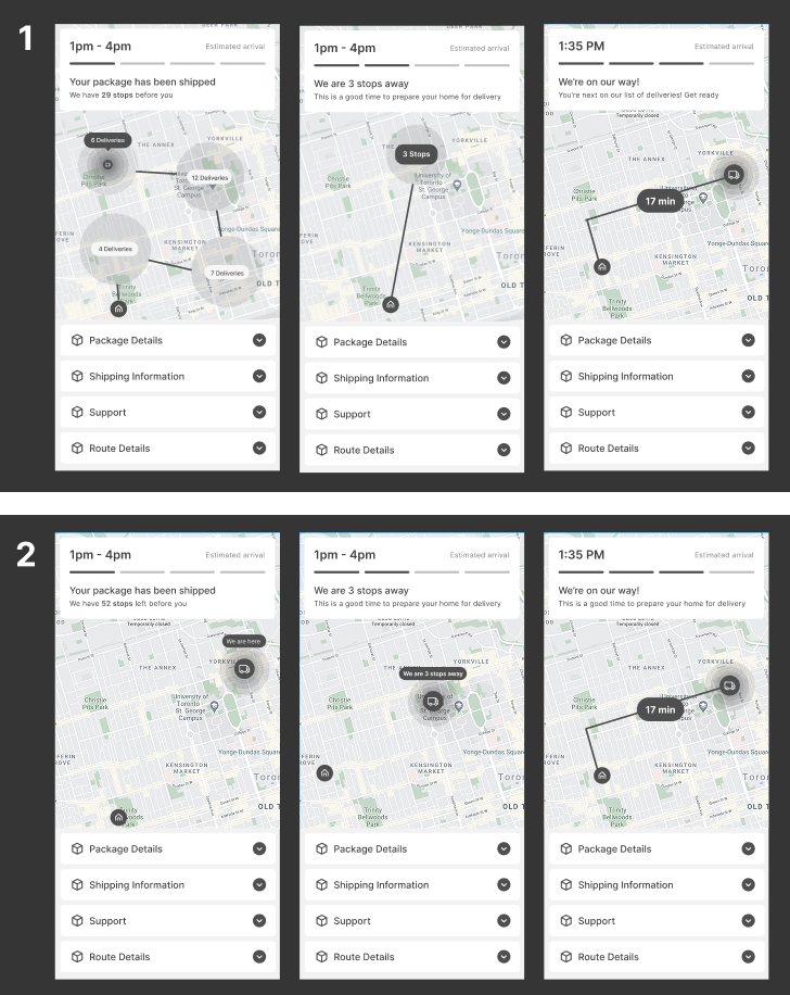
My Role: Lead Designer – I sketched multiple UI concepts (progress bars, stop counters, maps) based on conversations with key stakeholders where we brainstormed on how to expose our route planning back-en to our end users.
Why: To explore the widest solution space before converging.
User Testing Round 1
- Key Findings:
~30% of users didn’t understand the “routing cluster UI” that stakeholders wanted us to incorporate into our designs. - Users struggled when designs diverged from familiar app patterns.
User Flow:
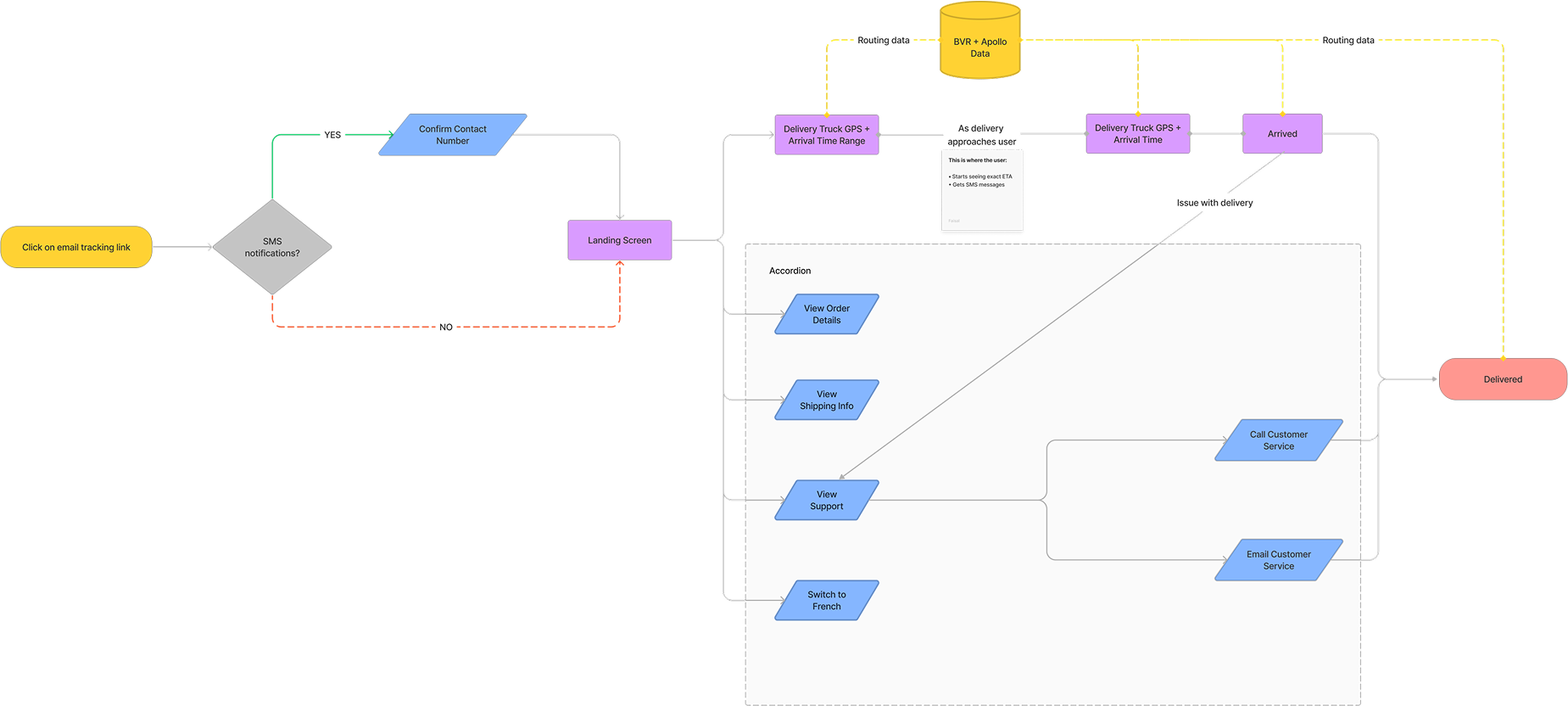
My Role: I designed detailed user flows for Galileo, mapping every step of the delivery experience—including reschedules and failed deliveries—to give myself and engineering a clear, shared blueprint.
Why: User flows aligned the team on Galileo’s architecture, reduced surprises in development, and helped surface edge cases early so we could resolve them before build.
Constraints
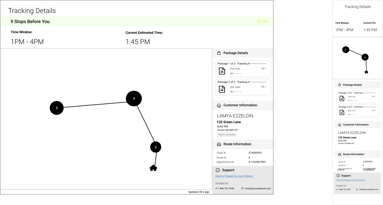
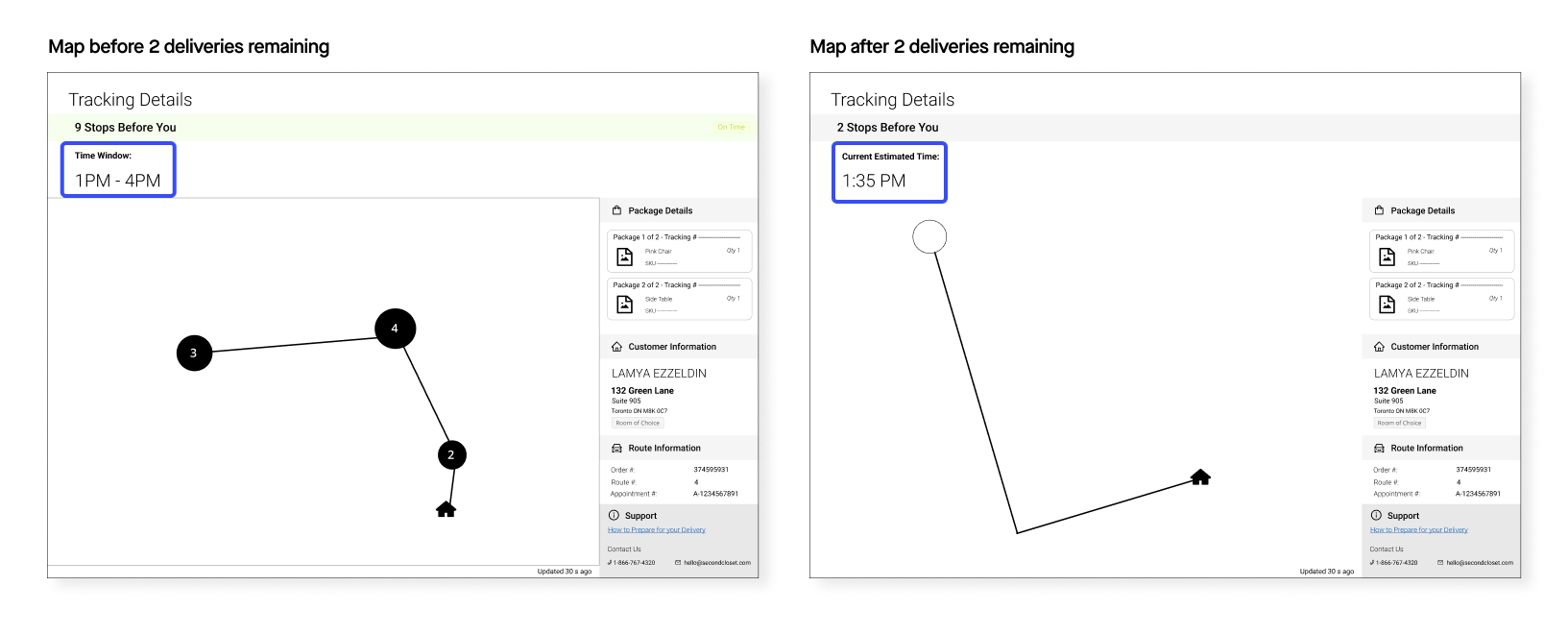
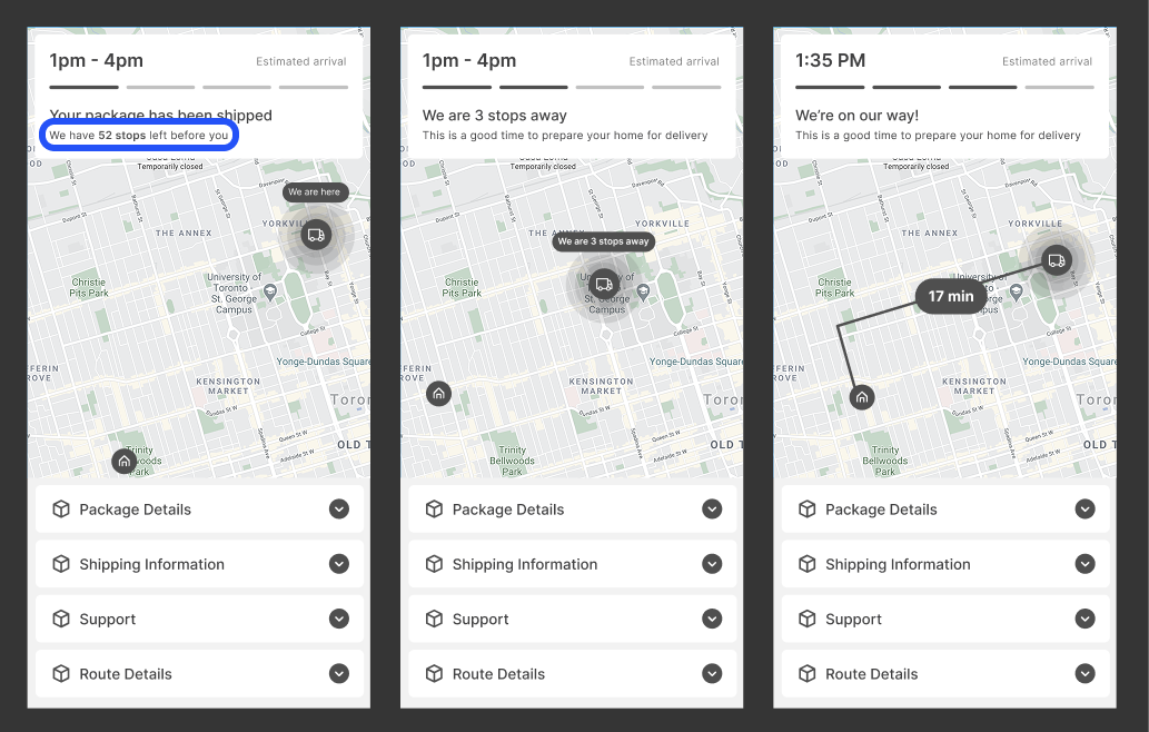
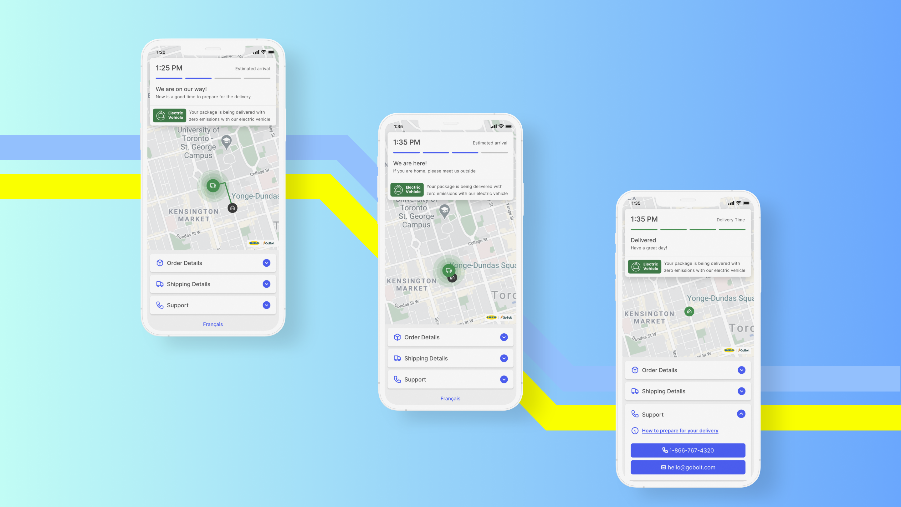
Although we could display a precise ETA, our data showed predictions were often inaccurate due to external factors. To build trust, we chose to show a broad time window until the truck was 3 stops away—at which point we revealed a more precise ETA.
Stakeholder pushback:
Balancing C-Suite Expectations with User Needs
Challenge
C-suite leaders strongly pushed for a routing cluster map UI (based on earlier client conversations). I suspected it would be too complex for everyday users and it was not part of their mental models.
Summary: Executives wanted a complex design that conflicted with usability.
Action
I ran usability tests comparing the cluster map vs. a simpler design. ~30% of users failed to understand the routing cluster. When leadership resisted, I suggested sending both designs to the client for feedback, reframing the decision around the customer.
Summary: I validated concerns through usertesting.com and reframed the decision to focus on the customer’s voice making it easier for stakeholders to agree on the user-friendly approach (2).
Result
The customer overwhelmingly chose the simpler design (2) and hence so did the stakeholder, aligning leadership with the user-friendly approach. This built trust with executives and ensured the product balanced business goals and user needs.
Summary: The simpler design won, and I influenced leadership to prioritize usability.
Design Iteration
My Role: I simplified the UI, borrowing metaphors from familiar delivery apps like DoorDash and Uber Eats to fit into the mental models of our average user.
Why: Familiarity builds trust, especially in high-stress situations like large item deliveries.
Key changes:
- Removed stop counts (to avoid skepticism about ETA accuracy).
- Introduced “You are 3 stops away” + dynamic ETA.
- Emphasized clear, concise status messages.
User Testing Insights: During testing I noticed that the total number of stops (highlighted in blue) before them led to some users being skeptical on whether the ETA was accurate especially when the stop number was high, so we decided to take it out and only show them the time estimate and proximity of the truck.
Notification Design
My Role: I defined the alert system with product and engineering.
Why: Research showed users preferred SMS over emails for timeliness.
Key Findings in Secondary Research:
SMS-first alerts reduced customer service calls.
Customers valued proactive notifications over manual tracking.
Notification timeline:

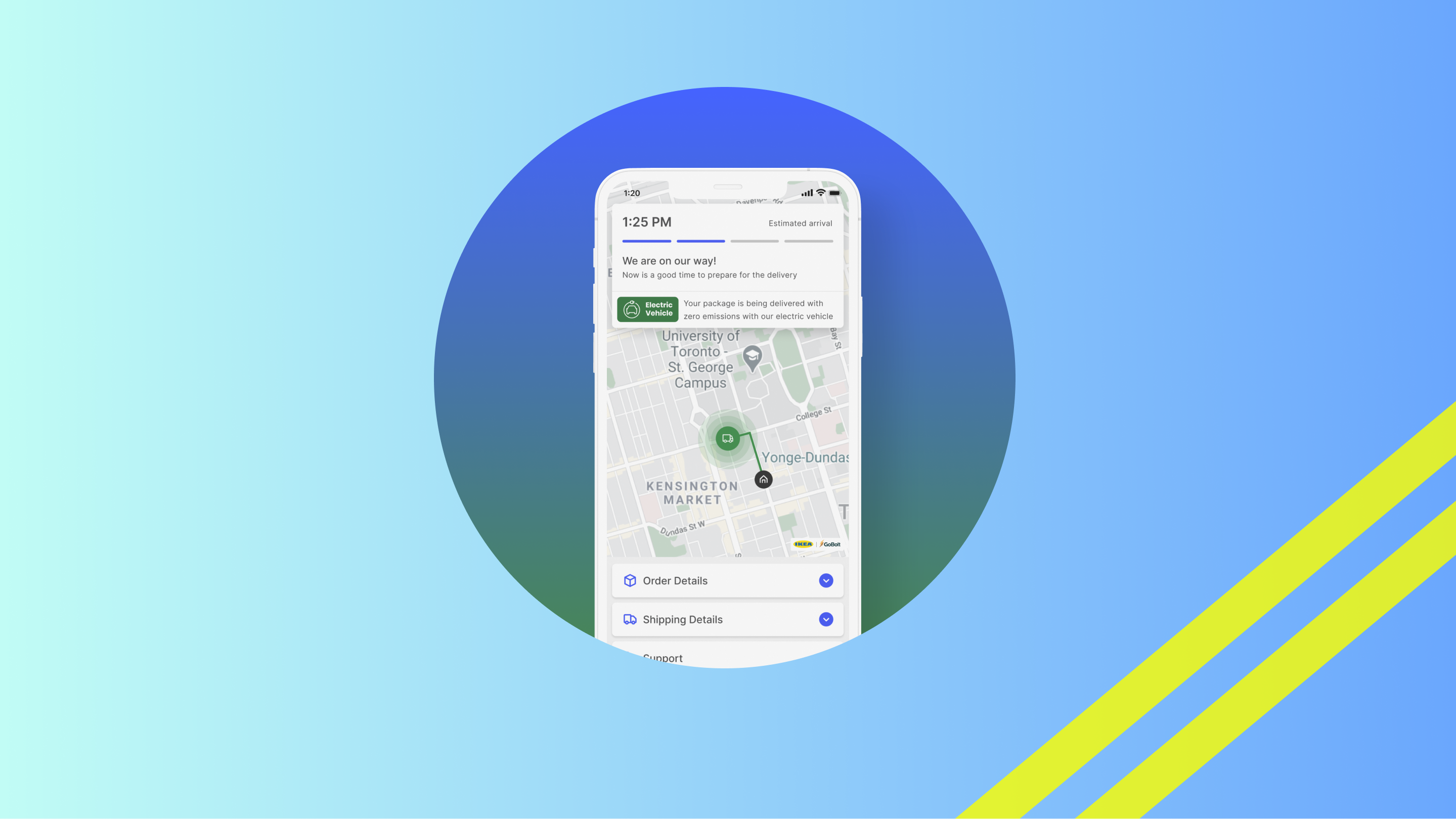
Market Differentiator: Sustainability Messaging
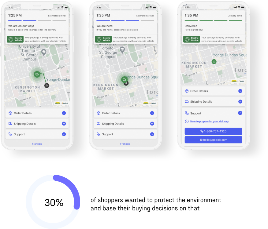
My Role: I recommended surfacing GoBolt’s electric fleet in the tracking UI.
Why: Based on the secondary research findings that ~30% of shoppers cared about sustainability; we could turn an operational advantage into a differentiator.
Result:
- We added a green Electric Vehicle label to our tracking landing page.
- Delivery tracking became a vehicle for brand storytelling as well as utility.
5. Final Outcome
What We Delivered
My Role: I ensured the final handoff included design documentation, interaction flows, and annotated specs to support engineering. I also facilitated the alignment of stakeholders around the final scope.
What we delivered:
Responsive web app
Clear delivery status and ETA.
SMS + email alerts.
EV fleet sustainability indicator.
Results
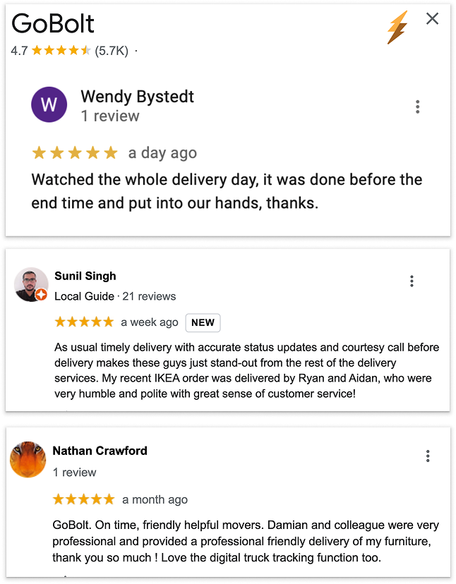
User Satisfaction: Tracking became one of the most cited positives in GoBolt’s Google Reviews.
Operational Efficiency: Missed deliveries and rescheduling backlog were significantly reduced by 36% YOY.
Merchant Impact: Helped GoBolt retain IKEA and secure new merchant partners.
Design Culture: Established repeatable research + testing practices in a logistics-heavy environment.
Brand Differentiation: Sustainability surfaced as a competitive edge in customer acquisition.
Next Steps
I proposed adding adjustable notification timing, letting customers choose if they wanted to be notified 5 stops away, 50 minutes away, or at another point. This would give shoppers more control and personalization while further reducing delivery-day stress.
High Fidelity Designs
Want to learn more? Email me at hello@faisalislam.co
Selected Work
Achievers Chat Integrations StrategyDelivery of chat integration's value through UX
Mixem Mobile AppEvents & Analytics UX/UI Design Case Study
PromysMobile and Web CRM Dashboard UI Redesign