
Redesigning Warby Parker's Product Selection Flow to Increase Online Sales
*Disclaimer: This project was a proposal and was never implemented at Warby Parker
Warby Parker started as an online retailer, but due to demand, they made the decision to open over a hundred stores all over North America. Why? My research concluded that the user's desire to visit a store was due to the fact that they wanted a second opinion that gave them the validation they wanted on a certain purchase. Hence, I incorporated the validation onto their website in order to increase online conversion.
Problem: Users were not buying glasses online as they could not validate their choice of frames without trying them on.
Solution: I incorporated two steps taken by the user on Warby Parker's website that would suggest frames based on the shape of the user's face. This would not only filter the number of options available to the user even further, but also make the choice easier (Hick's Law) and give them the validation we determined they need based on research.
Timeline: 2 Weeks
Role: UX + UI Design, Research, IA, Wireframing, Prototyping
For my first project at Bitmaker, I was tasked to redesign an existing e-commerce website with the goal of increasing customer acquisition.
I chose Warby Parker which started in 2010 as a purely online retailer for eyeglasses and sunglasses. Their target market is primarily urban, trendy, young adults seeking high-quality glasses at a reasonable price.
Objectives: To increase product sales online
Deliverables: High Fidelity Wireframes
Timeline: 2 Weeks
Role: UX/UI Designer
Problem Space
In the early stages of the business, Warby Parker’s customers would call and ask them if they could come over to their office and try on their collection. The founders ran the business out of their apartment, but due to the volume of these calls eventually decided to open their first retail location. Today, Warby Parker has over 100 stores all over North America.
The success of Warby Paker validates the importance catering to a demographic that still prefers to go to a store to try on glasses. That said, did Warby Parker really solve the problem at hand which was their customers not purchasing glasses online?
Research: User Interviews
I visited Warby Parker and its three main competitor stores (Bailey Nelson, Ollie Quinn and Clearly) in Toronto to find some answers. Below are the main insights from my interviews on whether customers prefer to shop for glasses at a store or online:
Key Insight # 1:
Users wanted to try glasses on before buying them.
Key Insight #2:
There are too many options online which hindered their decision-making when picking a new style.
Key Insight #3:
Users bought their glasses online only when they knew a certain frame style looked good on them.
In short, unless users know exactly what they want or do not have access to an outlet, they prefer to buy their glasses at a store where they can try them on. While Warby Parker is one of the pioneers of budget online retailers for prescription glasses, they do not offer online users any assistance with deciding on a pair like they do in their retail stores.
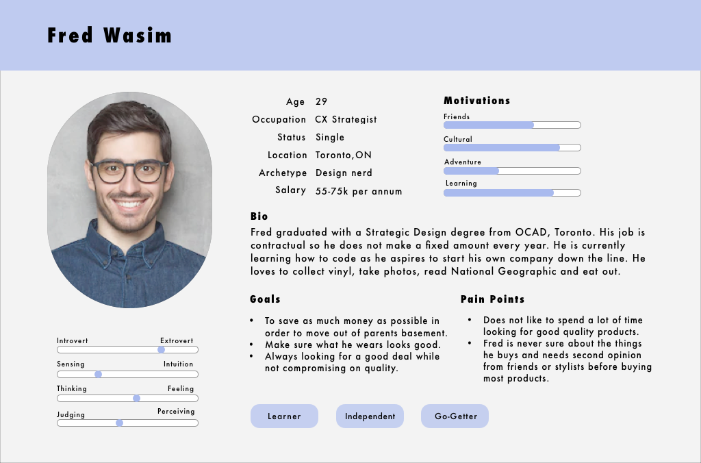
Persona
I created a primary user persona to represent the majority of target users. Fred is a consolidation of my research and interviewees. As we work towards a solution, Fred will guide the design decisions for the development and creation of my solution.
Warby Parker's target market is primarily based of urban, trendy, young adults seeking high-quality glasses at a reasonable price. Fred's generation is clearly comfortable using the internet, but then why were they booking appointments with the founders to try on the glasses?
Research: Card Sorting
During the card sorting exercise, my goal was to find the most common way users would organize the products available on Warby Parker’s Website. The reason why I chose card sorting was because the feedback provided above (about there being too many options online) made me want to find out the easiest way for them to absorb information.
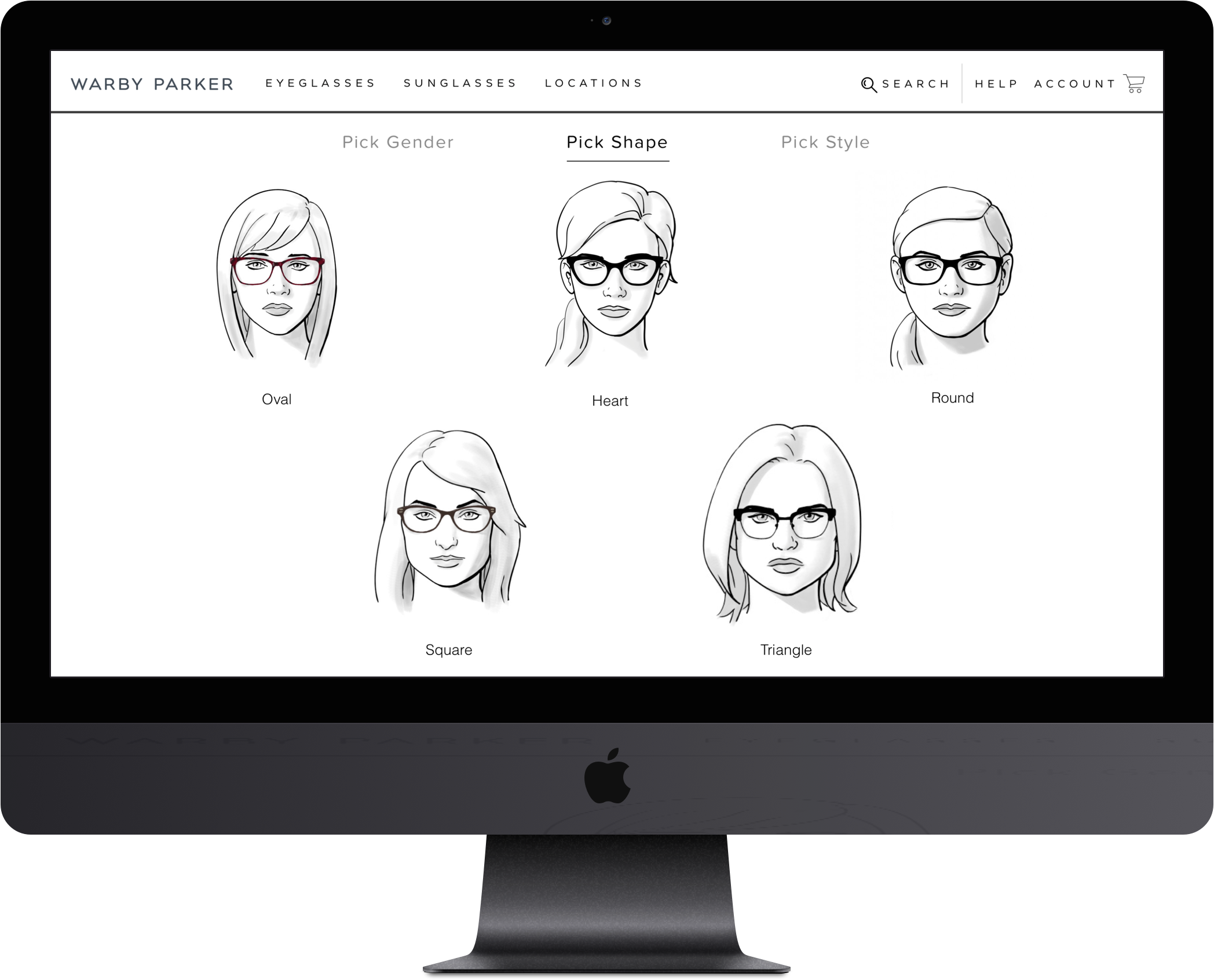
As demonstrated in Exhibit 1, the majority of users sorted cards into the classifications of the different types of frame styles such as Cat Eye, Round, Square and so on.
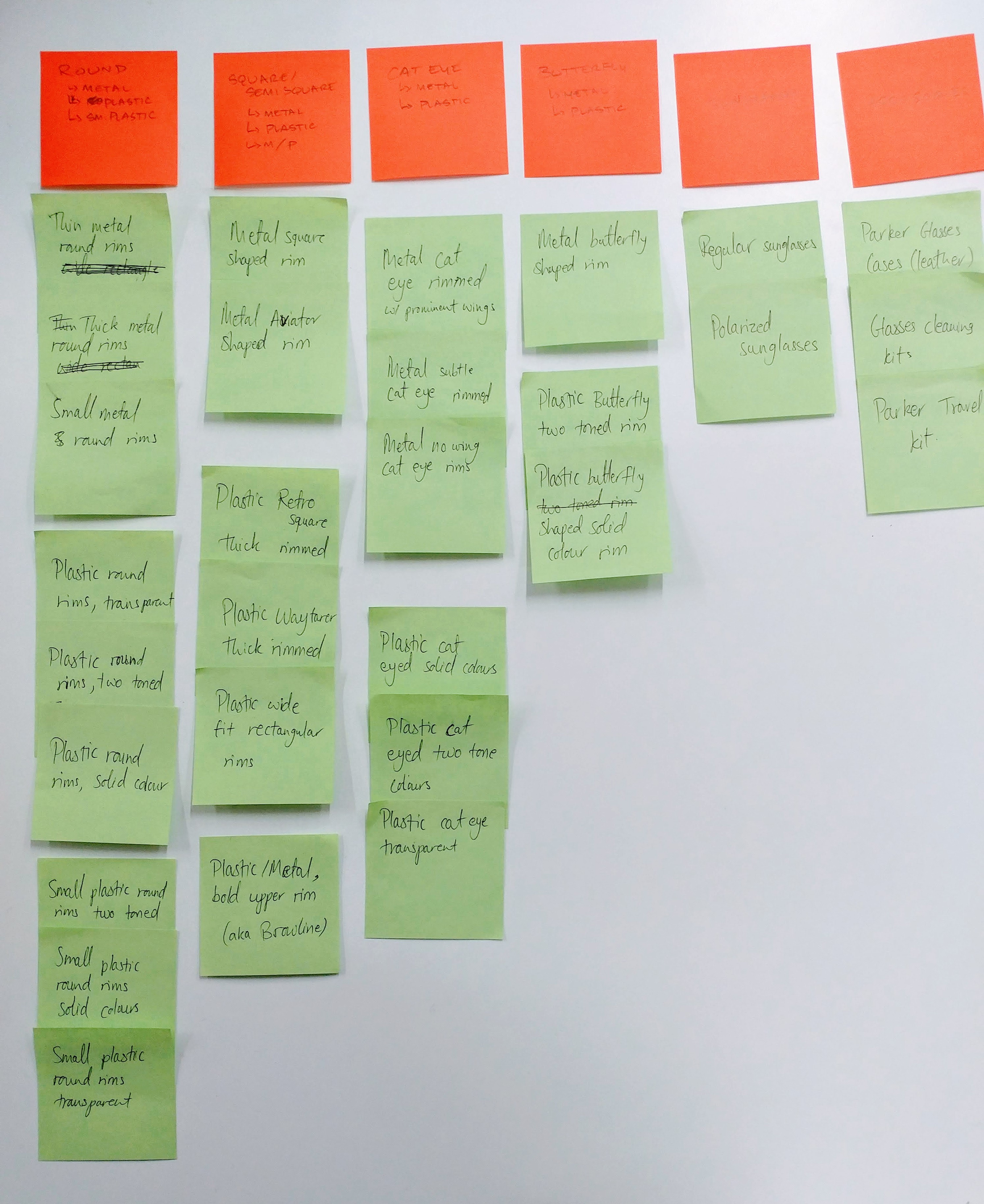
Exhibit 1
Research: Competitive Analysis
As demonstrated in Exhibit 2, the competitors had similar ways of helping users pick their glasses except for Clearly which had a guided decision process where they had a link to a face style guide at the bottom of their page. However, to find this face style guide the user had to go to the footer of the page and select the guide that was hidden among a dozen other links.
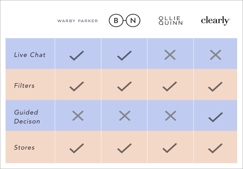
Exhibit 2
Research: User Interviews
I conducted more interviews to determine how users decide on the perfect pair of glasses for themselves. The main insights were as follows:
- Users do not like to make decisions on their own.
- Even when in a store and/or when trying on a pair of glasses for the first time, users like to get someone’s opinion whether it's a store attendant or 'face-timing' their friends.
- The only time users find it very easy to make decisions is when they are buying a pair they have previously owned and are already aware that it looks good on them.
Point of View: Problem Statement
After going through the data with a fine-tooth comb I realized that most users, whether asking someone such as an attendant at a store or their friend, were looking for validation or a second opinion when buying eyeglasses.
Mark needs a second opinion when he buys glasses because he wants his decision to be validated.
Based on this POV, I went on to find features that can be added to the website to assist with the decision process.
Ideation
As indicated above, after a few rounds of research, it was clear that the problem here was that users needed validation before buying a pair of glasses. I started searching for practices that could be incorporated into the website and found a guide that matches face shapes to multiple eyeglass frame shapes. This was the kind of advice that customers would receive during a visit to an eyeglass retailer so I decided to compile all the recommendations available on the internet for each face shape.
Solution
With the help of a step-by-step face-matching guide, customers will rely less on physical retail stores to finalize their purchases.
According to Hick’s Law, the time it takes for a person to make a decision is a result of the possible choices he or she has. Therefore, an increasing number of choices will raise the decision time logarithmically.
This is where the Meet Your Match feature comes in. It would pair users with picked frame styles that suit their face shape, reducing the number of glasses to choose from.
Userflow
All the other steps currently exist except the third column (see highlighted below) which is an extra step, but it significantly reduces the number of glasses that are presented to the user by only populating the frame styles that match their face shape.
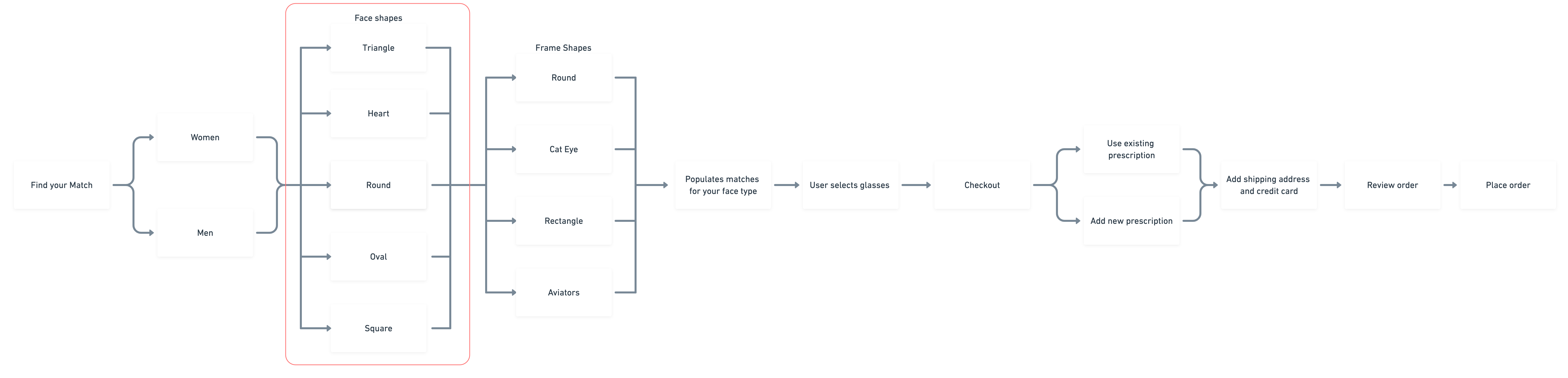
Note: As retail websites have sections segregated by just men and women, this flow had to follow the architecture of the existing flow at Warby Parker. That said, today I would push harder toward using general terminology in order to avoid indicating a certain style is limited to a binary gender. Inclusivity and accessibility are key in user experience design.
Usability Testing
With the prototypes of these low to medium fidelity wireframes, I tasked all my users to “Find a female's oval-faced round eyeglass that is a Staff Pick using the Find Your Match function.
First Iteration
Three of the users, once they reached the page where their matches are shown, realized they clicked on the wrong type of frame shape matched to their face. They had to backtrack in order to pick the right frame. To make it more convenient for users to switch back and forth between the different types of frames that suit their face shape.
Second Iteration
For the second page I was asked to use a different font size or colour to make the text visible where it asks users to pick either eyeglasses or sunglasses.
Third Iteration
Even after I changed the text size, users were clicking on the illustrations that demonstrate how style matching works, when they should have been clicking on either the eyeglasses or sunglasses illustration. This was because the step by step guide was above the buttons that needed to be clicked to proceed forward. I was able to solve this issue by moving the buttons above.
Medium Fidelity Prototype for User Testing
Note: As retail websites have sections segregated by just men and women, this flow had to follow the architecture of the existing Warby Parker website. That said, today I would push harder toward using general terminology in order to avoid indicating a certain style is limited to a binary gender. Inclusivity and accessibility are key in user experience design.
Learnings
Competitors may have used similar methods to solve a problem, but I realized that using their work as a benchmark and making it better sometimes yields as good a dividend as an idea that was created from scratch. In this case study, the face style guide was used by the company Clearly, but they did not incorporate it in their filters to narrow down the search for their users, hence validating their choice.
Additionally, I learnt that synthesizing data from research can result in information overload, but the problem is there if we just step back and view the data from the user's perspective.
Next Steps
I would add the option of users being able to try out their glasses through the selfie camera of their phones through an augmented reality app and also include the option on the web application. They would either be able to upload their picture or use the built-in webcam on their laptop.
(2020 update: This feature has now been implemented by Warby Parker through an iOS app, but did not exist at the time of this proposal)
Conclusion
While understanding that it is important for a brand like Warby Parker to have a physical presence, strengthening their online retail business to target the customers that do not have access to their stores will only further increase customer acquisition. By narrowing down the options available to the user, we are applying Hick's Law which assists them in making quick and effective decisions, potentially increasing traffic and revenue generated through their website.
Selected Work

GalileoDelivery Tracking Web App
Mixem Mobile AppEvents & Analytics UX/UI Design Case Study
PromysMobile and Web CRM Dashboard UI Redesign
CK LifeCase Study: Website Redesign to Address Caregiver Shortage